Design on a Tablet
Overview
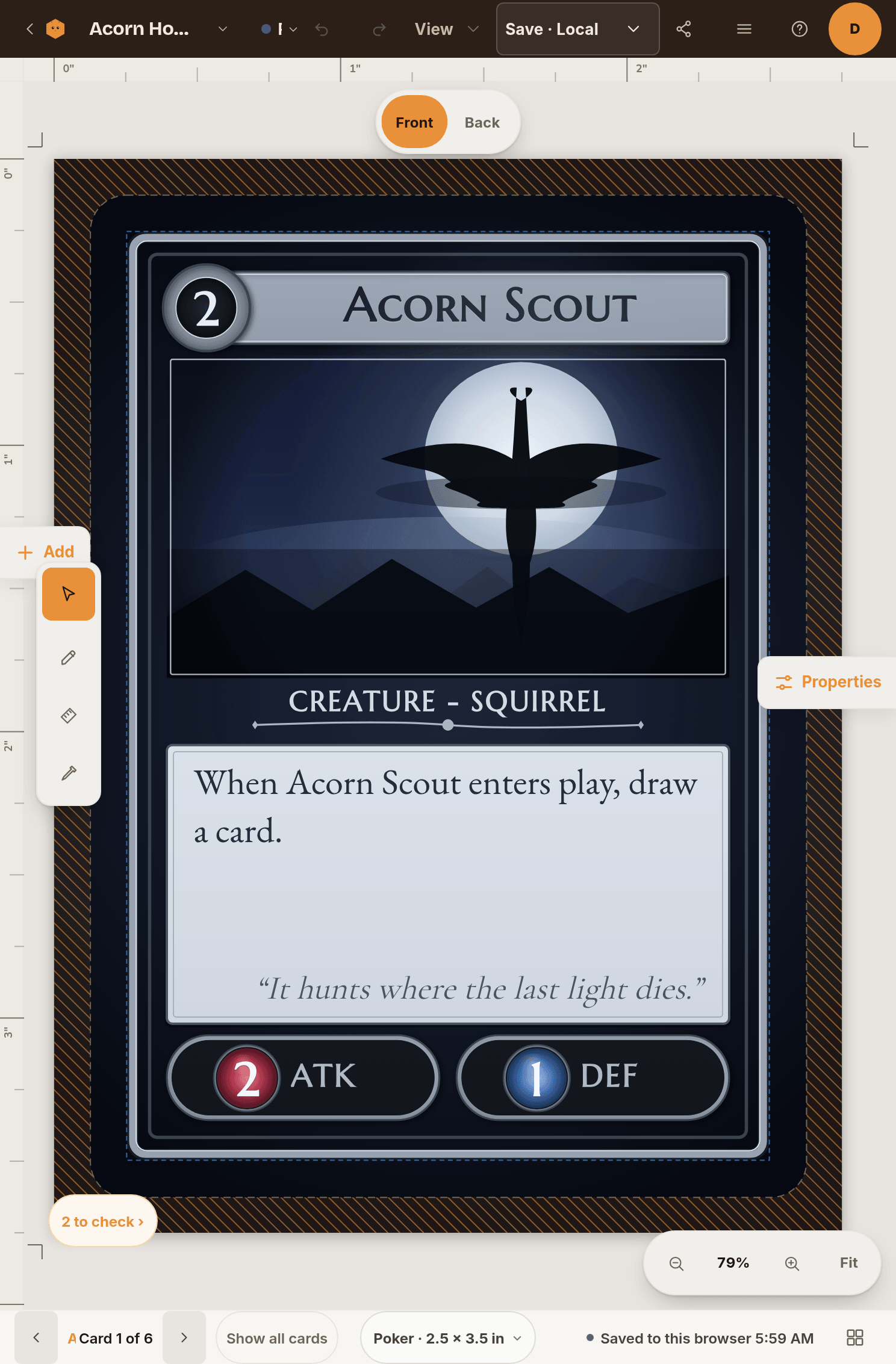
Ideas rarely arrive at a desk. You do not need a laptop to lay out a card. Tablets get the real editor, with the same Add panel, inspector and layers, rearranged so a finger can use them. This guide covers what you get on which screen, how to move around the card by touch, and what is still easier with a mouse.
Which screens get the editor
| Screen width | What you get |
|---|---|
| Under 740 px (phones) | No editor. You can view your cards and edit spreadsheet rows. |
| 740 to 1023 px (tablets held upright, small windows) | The compact editor. Add, Properties and the spreadsheet slide over the card as panels. |
| 1024 px and up (tablets sideways, laptops, desktops) | The full editor with the panels docked on either side. |
An iPad mini held upright (744 px) gets the compact editor, and the same iPad turned sideways gets the full one. Resizing a desktop window switches layouts the same way.
On a phone, opening the editor shows a card with View this project, Edit card data and a link you can email to yourself to finish on a bigger screen.
Touch gestures on the card
- Tap an element to select it. Tap empty space to deselect.
- Drag an element with one finger to select and move it. Drag its corner handles to resize or turn it. The handles are larger on touch screens.
- Double-tap an element to edit it, for example to type into a text box.
- Drag on empty space with one finger to pan the card around.
- Two fingers pan and zoom at the same time. Pinch to zoom, slide to move.
- Press and hold an element for half a second to open the same menu a right-click opens. Keep your finger still until it appears.
A stylus works like a mouse pointer, so you can click, drag and hold a button with it exactly as on a desktop.
Tip: Fingers covering what you are moving? Zoom in with two fingers first. Edges are easier to line up at a larger size.
The panels
In the compact layout, two buttons sit at the edges of the screen:
- Add opens the Add panel with text, images, shapes and more. Tapping something to add closes the panel so you can see it land on the card.
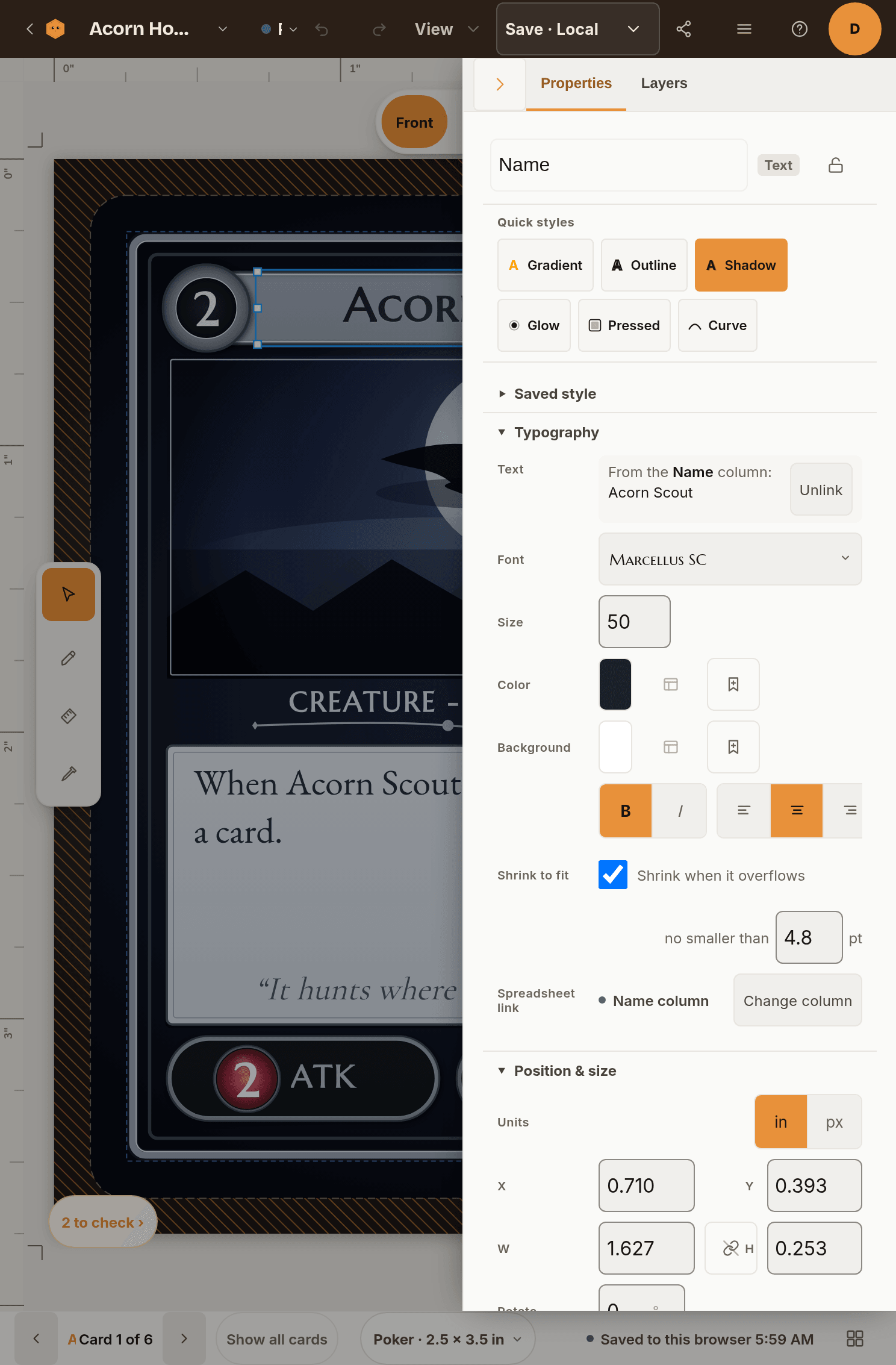
- Properties opens the inspector for the selected element, or the deck-wide settings when nothing is selected. Its Layers tab lists every element on the card.
- On the Data tab, the panel button opens your spreadsheet as a panel.
To close a panel, tap the dimmed area beside it, use the panel's own collapse button, or press Esc on a keyboard. Only one panel is open at a time.
Everything you tap is at least 44 px tall, and text fields use a size that keeps your tablet from zooming the page when you start typing.
Save and export from a tablet
The top bar keeps Save at the right, and the Export tab sits with the other stage tabs. Your work also saves on its own as you go. Games saved to Chitmunk Cloud upload their changes, and games saved in this browser stay on this tablet, so a cloud game is the better choice if you will switch between devices. To check, open the game menu and choose Where it's saved.
Exporting works as on a desktop: open the Export tab, pick what you want, and the file goes to your tablet's downloads.
What is better on a desktop
- Shortcuts. Nudging with arrow keys, Ctrl + Z and Ctrl + K are quicker than tapping through menus. A tablet with a keyboard attached gets them too.
- Big spreadsheets. Editing hundreds of rows is easier with a wide screen and a mouse.
- Pixel-level alignment. Panels docked on both sides let you watch numbers while you drag.
Troubleshooting
- I see a message saying the editor needs a bigger screen. The window is under 740 px wide. Turn the device sideways, widen the window, or exit split-screen.
- My finger pans the card instead of moving an element. Check that the element is not locked. Locked elements ignore touch, so the drag reaches the card behind instead.
- The menu appears when I only wanted to move something. You held still too long. Start dragging right away, or lift and try again.
- A panel will not close. Tap the dimmed area beside it. If a dialog is open on top, close the dialog first.
- My changes are not on my laptop. The game is saved in this browser only. Move it to Chitmunk Cloud from Game details.
Ready to try it?
Open the editor on your tablet, it is free to try. Your games are waiting.
Start Designing